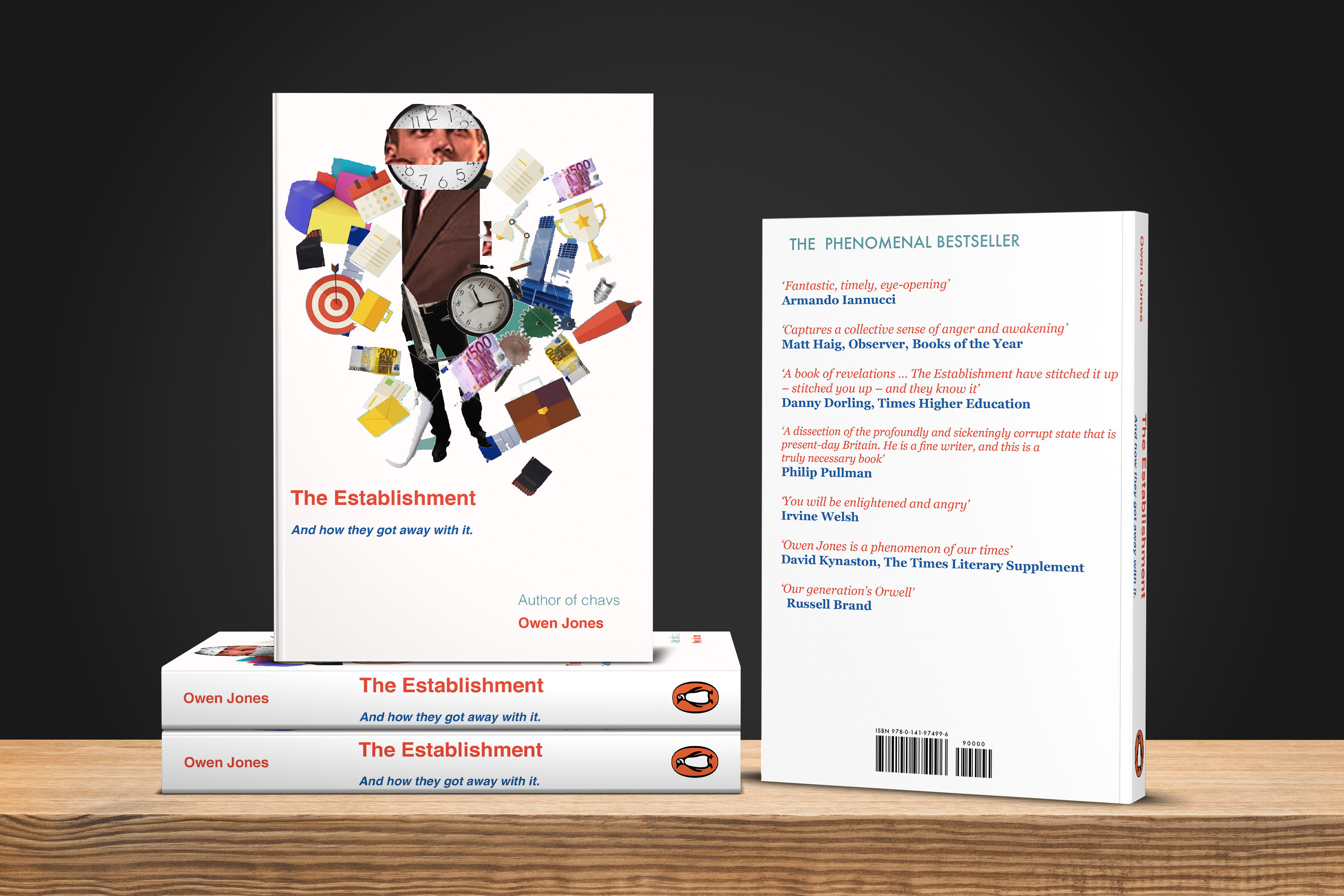
The Establishment - Collage
For this Book cover I was really pleased with this design , and the way it turned out , because I was looking at Collage Artists at the time such as: Henri Matisse , Hannah Höch , Peter Blake and a few others. And I really took a fancy to their colours and styles they used as well as materials which were mostly magazines , So using this knowledge I experimented with this style which was a trial and error in the beginning.
but slowly and shortly , it became something more and the book itself had meaning. I used my skills in Photoshop and Indesign /Illustrator to create this look and fit the 'politics agenda' and used the Red and blue colours which worked well together with the image and I was really happy with the result of what I achieved.
Fonts Used: Helvetica , Baskerville.
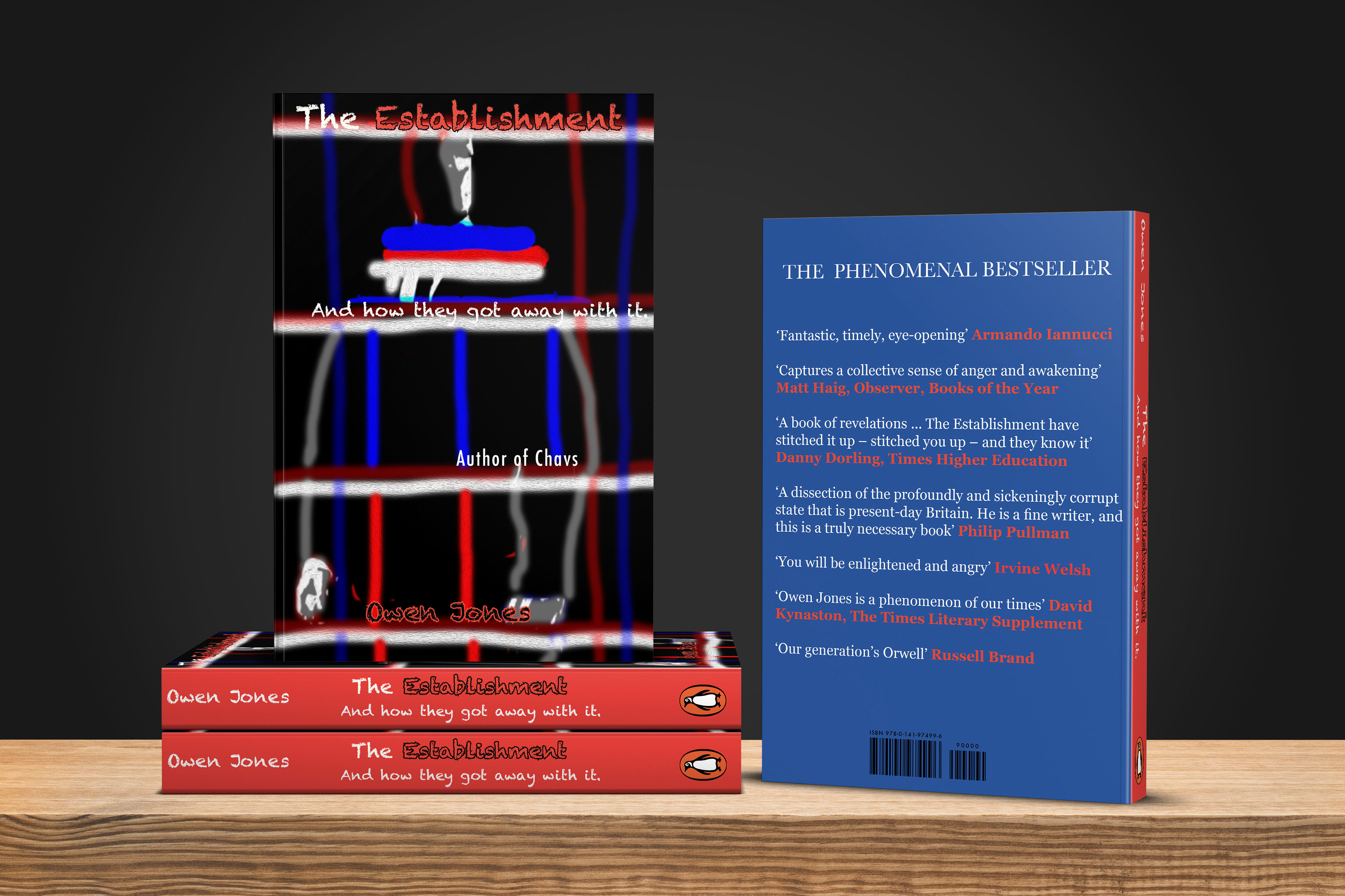
The Establishment - Digital version
For this Book Cover , I was experimenting with this whole idea of having the main image to be powerful as the book itself is about politics and people in power, which is a no brainer to my way of thinking , and since it's about the prime minster at the time: David Cameron. I originally had his face on the front page but decided against keeping it later on due to copyright on the image. So instead I designed an unknown figure which would represent his metaphorical character instead and stand out.
The colour scheme was inspired by the famous Union Jack Flag of England and its known colours are: Blue , Red and white with the cross so I wanted to show what this book would be located in , and the black background shows the sense of weariness and unsettling emotions which is politics in a nutshell. I also added the sense of dim lights to be effective as he is standing in the shadows and to make the book look more intriguing so the audience would pick it off the shelf.
Fonts Used: Baskerville , Online Font .
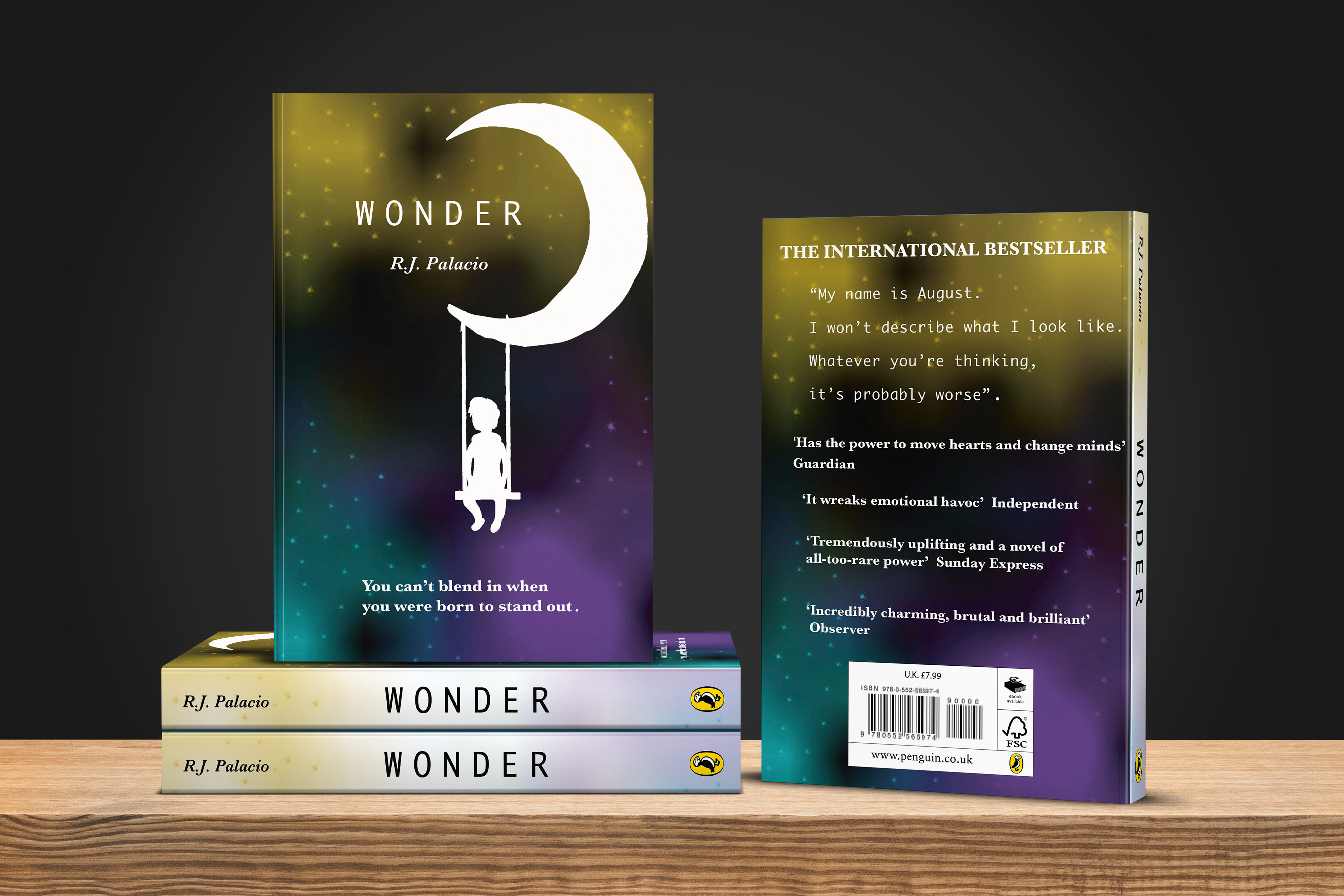
Wonder- Digital Book Cover
This Book Cover , was inspired by 'you can't blend in when you were born to stand out' and I really liked the Quote the book author stated , so I worked with what that meant and trying to show it as an image . I have seen the Film so I know it's about the little boy who has troubles at school and has an interesting face which doesn't always make people understand him. Which makes the film really moving , so I decided to look past that and focus on the theme of 'Space' as throughout the film he wants to become an Astronaut as his future career and I saw a lot of book covers being done with drawing the helmet of the space man.
So I thought it would be another direction if I changed my design thinking and stand out in another way , I thought about the impact of the illustration standing out in this white outline and the boy swinging to represent the chance of hope , also the Moon because I was focusing on the space theme without giving too much away. Also Working with the font and typography to make this presentable to the readers. And I really liked the font on the main title of 'Wonder' and the Authors name, But I wasn't too sure about the blurb on the back of the book so that took longer to process.
Fonts used: Baskerville , Arial black.
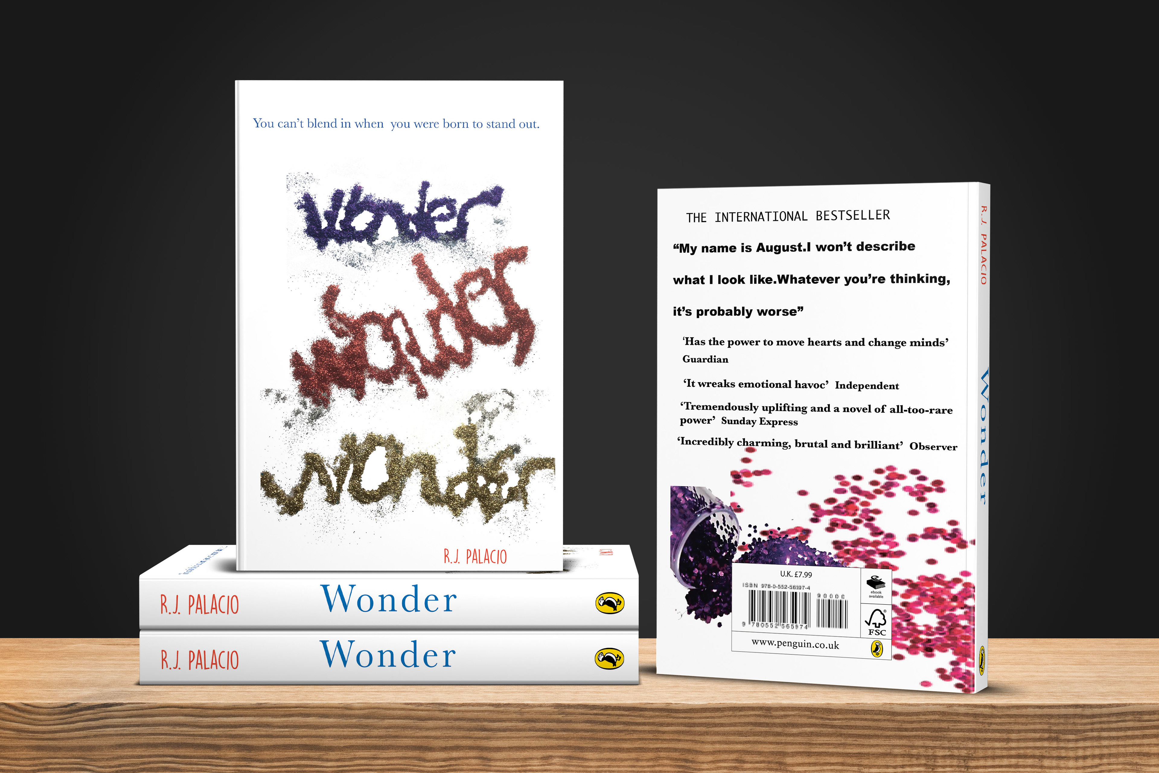
Wonder- Mixed Media Cover
For this Book Cover I created the typography using Glitter and had a lot of fun making a creative mess , but wasn't so fun cleaning it afterwards. I focused on the colours I had and put my self in the shoes of a child's mind to express that feeling of having fun and being joyous and spelt the word: Wonder to create the title in different colours to empathise the feeling of being together and everyone creating there own word using the glitter.
There was a strong meaning behind the Glitter and in time It became more an experiment process , and the back took a lot of time to get close to what I was thinking about , and I would of made changes if I had more time to work on it as well. Especially the back cover.
In the end I know there could of been improvements with this one but I wanted to show the potential.
Fonts used: Baskerville. Helvetica.